Design Jargon Decoded: Part 2 — Website Design
- Sep 30, 2024
- 3 min read
Updated: Jan 7
"Responsive Design"
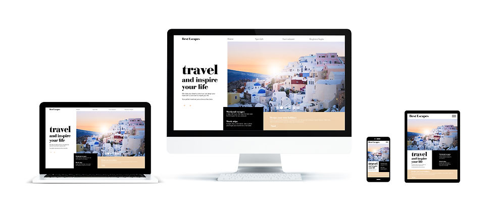
Responsive Design
Designer’s Definition: A web design approach that ensures layouts adapt to different screen sizes and resolutions, from mobile devices to desktop monitors, using flexible grids, media queries, and CSS techniques.
Non-Designer Lingo: Mobile-friendly design
The Verdict:
Use "Responsive Design." While "mobile-friendly" is simpler, "responsive design" covers ‘all devices, not just mobile. It also sounds more technical and professional, which builds credibility when discussing web design.
"Wireframe"
Designer’s Definition: The basic structure of your website—a low-fidelity guide that gets everything in place before the design process starts.
Non-Designer Lingo: "Website outline"
*Anna's Articulation:
Think of it as the bra for your website (sorry, Mom)—providing support and shape before you slip into something more stylish.
The Verdict:
"Wireframe" is the proper term and is crucial in the early stages of web design. Don't leave the house without it.
"Above the Fold"
Designer’s Definition: The portion of a webpage that is visible to a user before scrolling, analogous to the top half of a newspaper, where the most important content lives.
Non-Designer Lingo: "Top of the page"
*Anna's Articulation:
To state this simply, this is your most critical content. This is where your main message, your value proposition, the prime real estate for attention. Give me a reason to scroll.
The Verdict:
Stick with "Above the Fold." Although it’s an old newspaper term, it’s widely used in web design and marketing. It implies that what’s visible immediately matters the most.
"Call to Action" or "CTA"
Designer’s Definition: A website element designed to encourage immediate action from the user, typically in the form of a button or link.
Non-Designer Lingo: Action prompt
The Verdict:
"Call to Action" or CTA is a staple in marketing and web design. "Action Prompt" is too vague.
Now that you're warmed up. Here's two terms tossed around a lot but rarely understood.
5 & 6 User Experience (UX) / User Interface (UI):

Designer’s Definitions:
User Interface (UI): The visual elements of a product or website—the buttons, icons, spacing, typography, colors, and responsive design.
User Experience (UX): The overall experience a user has when interacting with your product or website.
Non-Designer Lingo:
UI: How your website looks.
UX: How your website feels to use or "visitor satisfaction"
*Anna's Articulation:
The glass ketchup bottle is the UI—classic, iconic, and it looks great on your table. But when you're wrestling to get ketchup onto your fries, that's lacking in UX. The humble plastic squeeze bottle? Less stylish, but it get's you what you want. Sans mess. The best designs find the right balance.
The Verdict:
Know your audience. Understanding the distinction between UI and UX is important in design discussions. Use these terms when appropriate, but ensure your audience is on the same page.
SEO" (Search Engine Optimization)
Designer’s Definition: The practice of optimizing a website to rank higher in search engine results.
Non-Designer Lingo: "getting found on Google"
The Verdict:
Always go with "SEO." It’s one of the most recognizable acronyms in digital marketing. If you’re in business, this is one acronym you need to know.
Final Thoughts:
Your website is either working for you or against you—there’s no in-between.
If your design isn’t responsive, your SEO isn’t optimized, or your user experience is clunky, you’re missing out. Struggling with any design terms or want me to break down new ones? Let me know—no jargon should stand between you and a better site.

Comments